Quarterly Offerings
A major UX/UI and development challenge that I overcame with iterating, experimentation, and tracking.
Skip to Quarterly OfferingsThe Triangle Learning Academy is an internal-facing learning platform for most Canadian Tire, Mark's, FGL (Sportschek), Party City, and PartSource employees. It empowers them to learn new skills that promote personal and professional growth at no cost from a variety of different sources and materials.
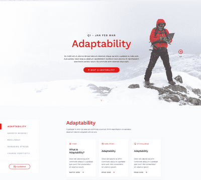
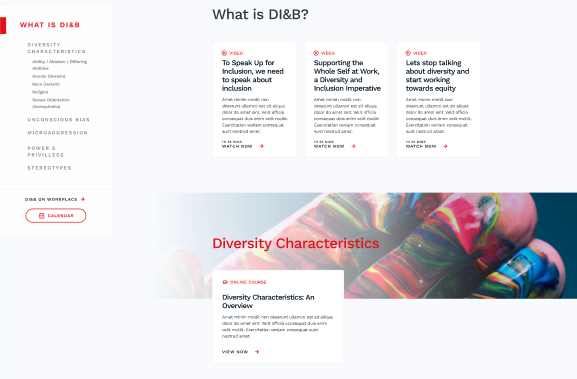
In 2020, TLA organized content with themes for every quarter. In Q1, it was Adaptability, and in Q4 the theme was DIB. In service of this theme, we created what we call "Quarterly Offerings". These pages contain every course, resource, and workshop that relates to the theme of the quarter that the TLA recommends.
To serve that much content in a digestible way, I first sketched out some possibilities and prototyped them with the team. After several rounds of feedback and refinement, while deepening my understanding of the issue, I decided to use cards as the basis for the page.
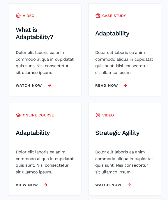
Each card has certain characteristics that describe what the user is clicking on, in a short amount of space.
A card would belong to a section of the page.
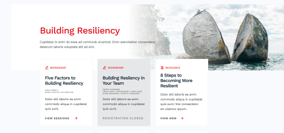
Each section would have a title and background image. The text was removed later for the sake of simplicity. The cards that belong to the section overlap onto the background image to denote that this set of cards belongs to the section's header.
The layout around the sections served to guide the user to content on the page.
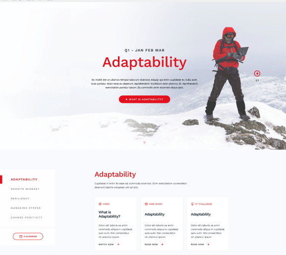
The sticky sidebar uses the intersection observer Javascript feature to highlight the section of the page that's currently in the viewport. The masthead is a quick intro to our theme and links to an explainer video on the quarter's content.
In the Q1 and Q2 of 2020, the page was generated by a local WordPress and ACF install. I would copy the resulting HTML and paste it into our platform. To maintain all of the information was a major time-sink for the team, as there was a gigantic spreadsheet to keep all the information in one place, and also keeping track of tasks in Trello. One of our managers discovered a Trello plugin that allowed the use of custom fields. We also discovered this information could be exported.
To save the entire team time and to keep all of our information in one place, I endeavored to find a way to make use of the exports that Trello provided me with. I learned about handlebars.js, a templating engine that used JSON. Through a lot of experimentation, I discovered that by exporting a Trello dashboard in .csv format and changing it to JSON I could use the data to populate the page. I created a 3 step updating process for myself (in WordPress I would input all the data manually), and simplified the procedure for others on my team, saving several hours in Q3 and Q4.
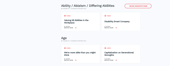
In Q4 2020, I changed up the cards a tad. I integrated different sizes of cards that were two-wide.
The cards nowadays indicate the duration of the resource. The sections sometimes have sub-sections, which required hiding the descriptors since there were so many in a row to decrease the height of the page.
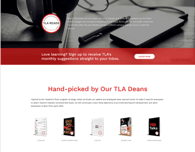
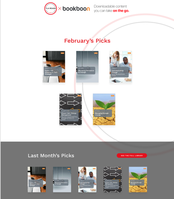
This was the first page I redesigned for TLA. The original version used an accordion style popout when clicking on book covers, which would shift elements on the page around. I liked the concept of drawing in users with the cover, so I changed the accordion to a simple lightcase.js gallery lightbox.

Below that, we included e-books and audiobooks by Bookboon. These proved to be super popular - our learners liked reading and listening at their own pace, so our team decided to turn it into a monthly program. Later on, it became the main focus of the page, so the order was flipped.
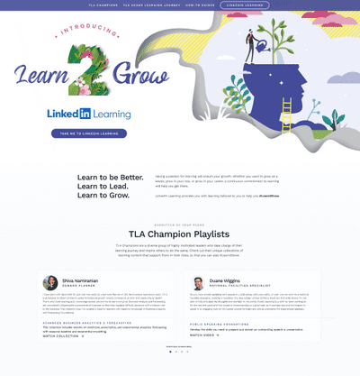
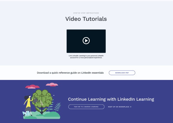
This page is our landing page for LinkedIn Learning. It gives our users with access to the platform, provides helpful tutorial videos, and has suggestions on what courses to check out.
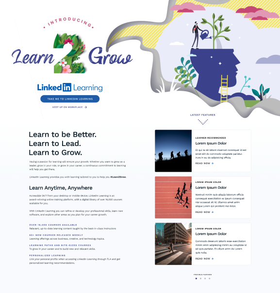
The beautiful header graphic was designed by one of my colleagues. I integrated it as naturally as possible, leaving the left side to house our main and secondary CTA's.
Below the masthead, the initial design included copy to convince our learners to use LinkedIn Learning. To the right, the page displayed the "Latest Features", a carousel of courses that the TLA team updated bi-weekly.
However as time went on, we discovered through Google Analytics that most users weren't interacting with our featured content. The page was simplified, and today it looks like this instead.
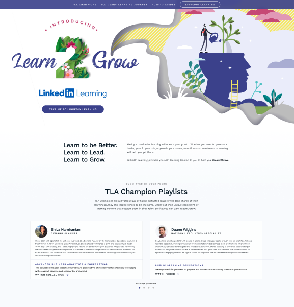
In the initial design, the champions section was further down on the page, but it actually had more interactivity than the latest feature carousel. A champion is an employee that has submitted a course to be shared with fellow employees. The social nature of champions being able to share content reigned supreme over the latest features content and replaced it completely. We also shortened the copy as LinkedIn Learning became more popular with our learners, and added an in-page sticky navbar to let our users jump around the page with ease.
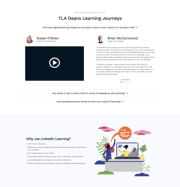
The TLA is backed by several deans who are high ranking employees from across our brands and collaborate with our team. TLA's main purpose is to drive employees to keep learning. By using testimonials from our deans about on-going learning, we hope to reinforce that purpose.
As the user scrolls down the page, they'll find a list of benefits to using the LinkedIn Learning platform. Surprisingly, a number of our users were found to use the CTA at the bottom of the page, contrary to the usual heatmap patterns of a webpage.
To help our users troubleshoot LinkedIn Learning we send them to our video tutorials. Here, we've created videos on how to get started with the platform.
The bottom CTA proves to catch any stragglers and is notably popular with our users.
Connect and we can discuss UX!