Homepage
The homepage features a lot of peeks into what the mosque's main services are.
Skip to Home DesignThe IFC is a local Mosque that has a strong web presence with numerous livestreams, but they needed a website that could work for them and provide self-service features that would free up the managing staff's time. As an outsider to the Muslim faith, this was a unique challenge in understanding the needs of their demographic.
After many discussions with the main stakeholder, I started with a very simple wireframe, contrary to normal procedure. As I wasn’t able to have direct interaction with the interviewees, I decided that a visual aide would be crucial to gain actual feedback.
Afterwards the team and I created questions about the wireframe and also in general about the new website.
Layout
Content
Look and Feel
This extensive list of questions was sent out to the 7 volunteers and were answered thoroughly. I was able to extract the main priorities of the mosque and it’s community.
From those findings, I felt confident with the overall layout. We went through a number of colour pallet decisions, and decided on this pale brown (Calico) colour due to a historical aspect of how this Mosque was started. To contrast, I felt a rich blue (Chathams Blue) worked well.
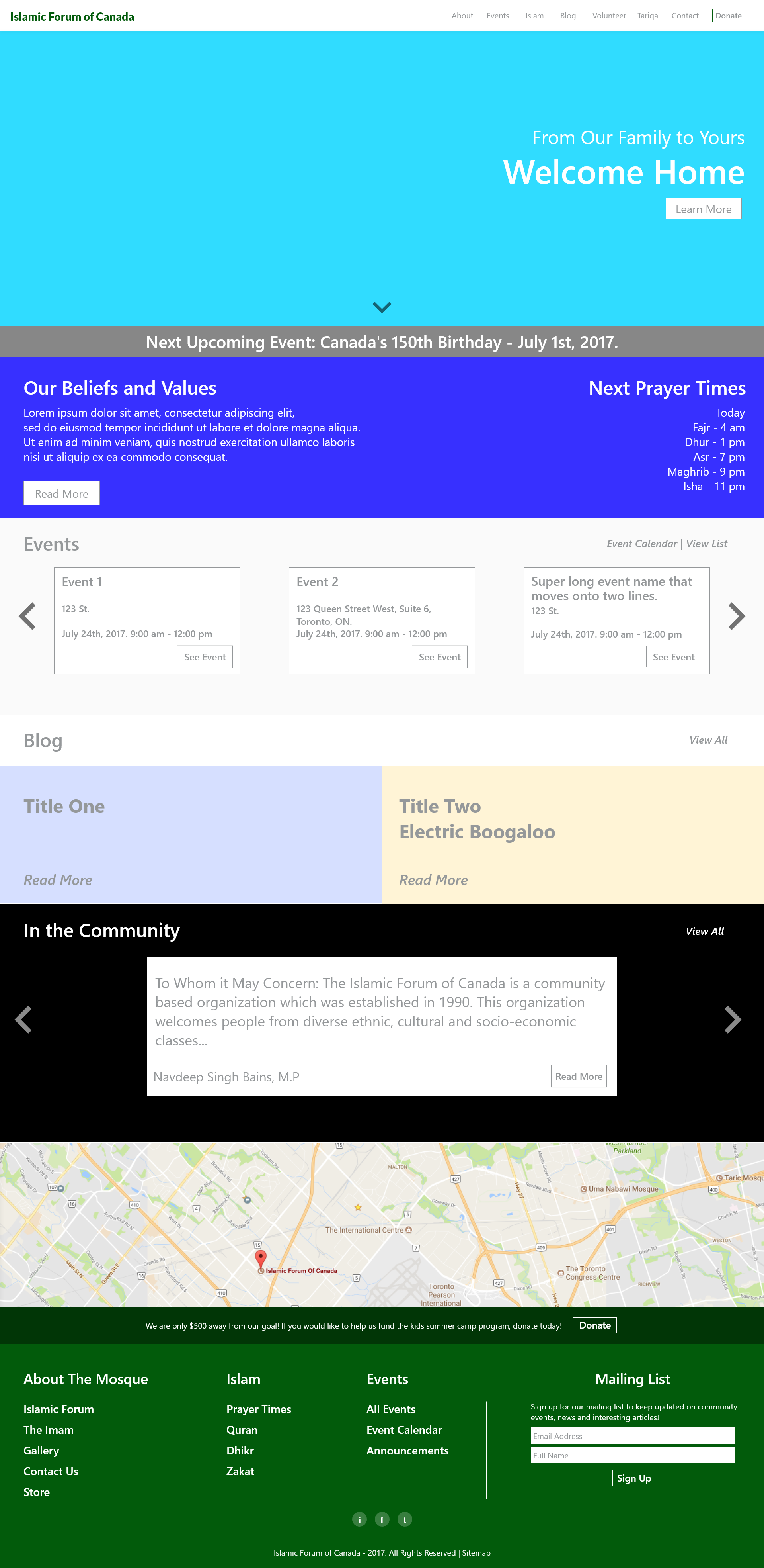
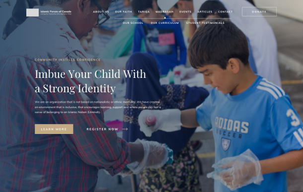
The current version of the homepage shows most of what the mosque offers, without being overwhelming.
In a short amount of time, the visitor is able to figure out who the website is for, what it is about, and it's main objectives.
The masthead always displays the current prayer times. This is achieved by using Advanced Custom Fields, and filling in a large repeater. The logic to detect what prayer period should be displayed is by checking when the "start" date is, and comparing that to the current date.
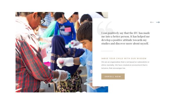
The school, or Madrasah, is one of the main avenues that the mosque collects donations. It is an after school and weekend program that children participate in and learn more about their faith, as well as some fun mixed in. As it is one of the larger contributors to their bottom line, I chose to make this portion of the page a testimonial call to action section.
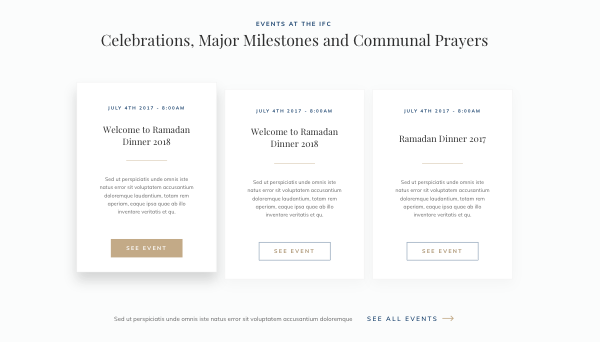
Using The Events Calendar plugin, visitors will be able to check out the latest events that go on. During the pandemic, the mosque has resorted to using livestreams as a way to reach their followers, and the inner event pages will be able to host their livestreams via YouTube.
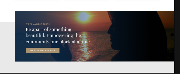
This final call to action is sitewide where it makes sense. The usage of the background popping above a darker off-white background really makes it more eye-catching then a regular banner type of CTA.
Design and Development wise, this is the section I'm most proud of. In the Islamic Faith, there is a set calendar of prayer times, to the minute, that are determined by the current date range.
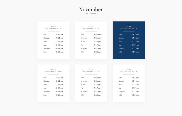
The prayer times page shows the current month's time period first, broken into their own sections by period.
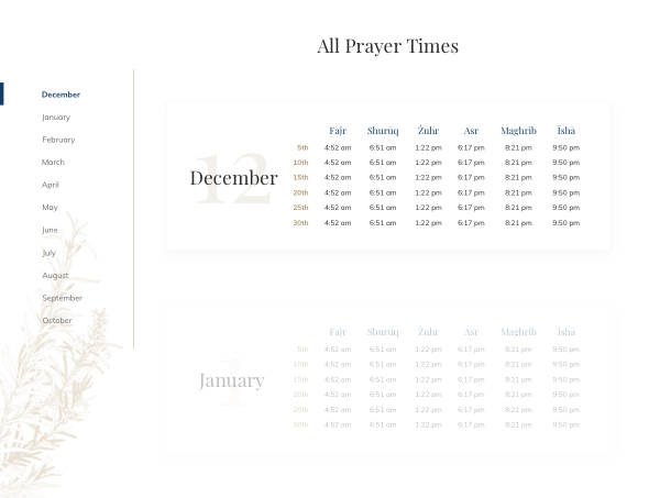
For the rest of the months, they're changed to a table style format. The next upcoming month is opaque, but the rest are somewhat transparent (will become opaque on hover). There's also a sidebar for easy navigation.
Using ACF, the backbone of any WordPress theme I make, I created a Prayer Times repeater field. The field looks like this in the backend editor:
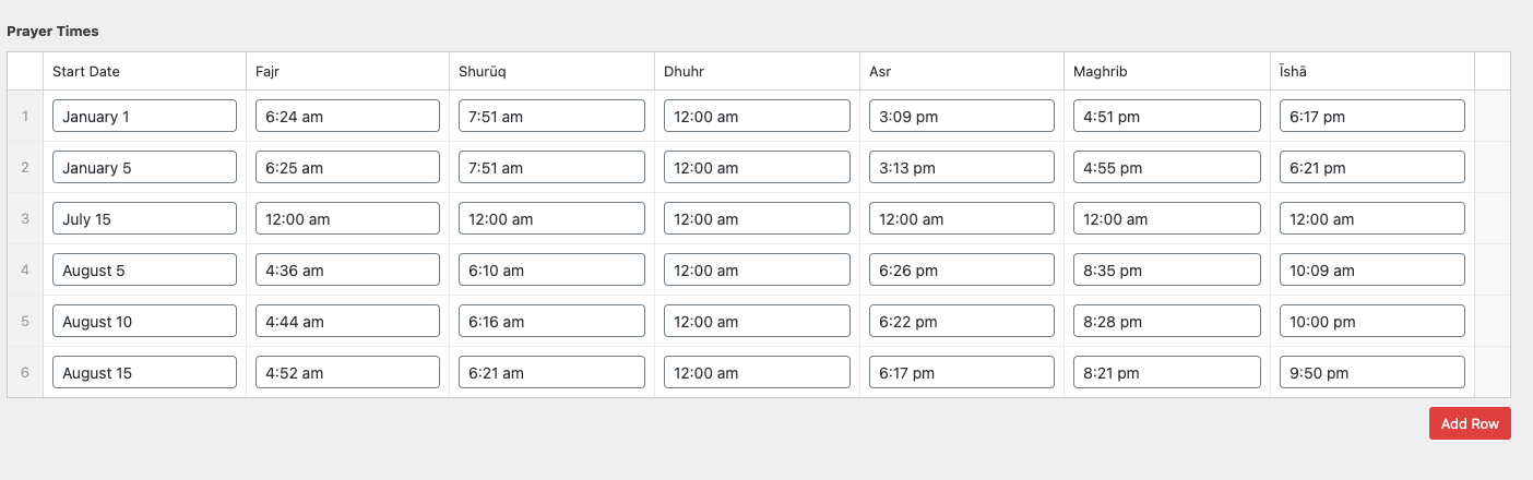
The basic PHP logic is to group the prayer times by month, based on the start time, and create a 2D array. It will then loop over each month and print out a table. If it's the current month, it will be skipped.
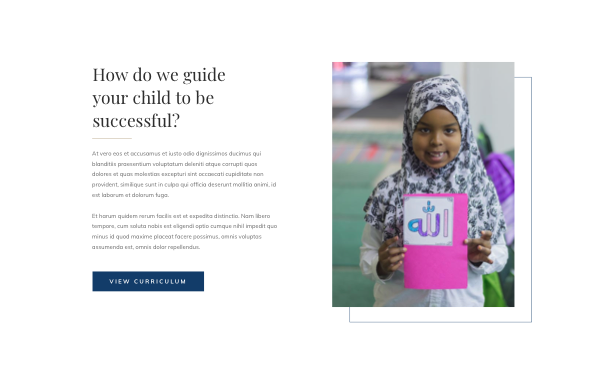
This section of the site has a high importance on the success of the mosque, and as a result needed to be treated like a secondary homepage.
This was designed to be more traditional in appearance, and get a strong message across that will hopefully encourage the user to enroll their child. There was a lot of strong imagery that the managing team already had, so I chose to lean into that more.
The Madrasah navigation item has a sub navigation that's always visible when on any page that's related to it.
The following two sections leans further into their strong imagery, and provides a spot for the team drive home the philosophy that drives their school. I decided to make a single link out to a curriculum page, to restrict information overload.
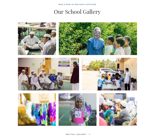
The best way of showing what their children will be doing in class is with photographic evidence. The gallery is a preview of a full gallery page, and it generates feelings of trust. I put this at the bottom because the only it's likely some users would reach the bottom of the page without taking an action in search of finding reasons to trust the program.
Are you looking to do something similar? Let's connect. I can advise you on how to go about the process.