

Tips & Tricks
How I simplified these important pages for our customers
Learn MoreDuring my time at Hydro One, I have demonstrated the value of UX and good design. I unified the tips and tricks section, developed multiple marketing campaign webpages, and endeavored to bring clarity to a misunderstood organization.
Example Page Design: https://www.figma.com/proto/QrlpWnH7QxHRNjLTV5lrg8/Applicance-%26-Energy-Savings-Tips?page-id=0%3A1&node-id=2-61&viewport=1164%2C1217%2C0.41&scaling=min-zoom
Final Page: https://www.hydroone.com/saving-money-and-energy/residential/tips-and-tools/appliances
I started by working on the tips and tricks section of the Hydro One website. My first task was to create a consistent look across all pages in the section, starting with the Cooling tips and tricks page. To achieve this, I reviewed each page to identify common elements and used a similar design style throughout. These pages were featured in the monthly newsletter.
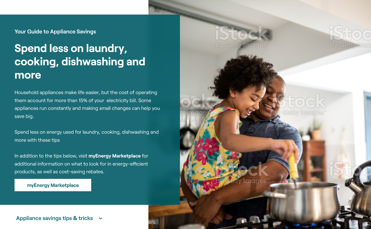
For each page, I ensured there was a clear call-to-action in the masthead and modernized the design with overlapping elements that didn't detract from the image.
The on-page information was presented in a user-friendly layout, making it easy for readers to skim the content without being overwhelmed with too much information.
Another improvement I made was adding a slider at the bottom of each page, which provides links to other pages within the tips section. This feature has resulted in increased time spent on the site and a lower bounce rate.
Live Page: https://www.hydroone.com/about/energizing-ontario
The Energizing Ontario blog is a significant platform used by Hydro One to highlight its positive initiatives and community investments. In my redesign of the page, I focused on improving the user experience by making it easier for visitors to search for specific blog posts using Filterizr.
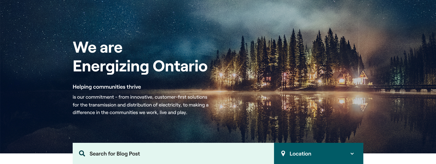
I have improved the clarity of each blog card by implementing a strict character count for each one. Although the elements were similar to the previous design, I aimed to modernize it by adding overlapping elements and optimizing their placement to improve ease of understanding with just a glance.
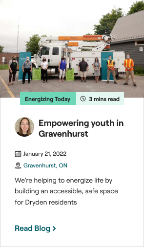
In addition, I have revamped the blog pages themselves. I looked to Medium as a reference for font size and readability to ensure a pleasant reading experience for visitors. To make sharing easier, I incorporated a sticky social sidebar. Additionally, I added elements like a highlight box to draw attention to important pieces of content.
Example Blog: https://www.hydroone.com/about/energizing-ontario/blog/trans-wellness
When I joined the organization, they did not have an in-house UX designer. I was tasked with convincing the executive team to invest in a full-time web designer. After successfully proving the value of having a designer, my contract was extended.
A rebranding effort was already underway when I arrived. The website had been updated to the new brand colour of teal, but otherwise remained the same. My work adhered to the new brand guidelines, but I had some flexibility to interpret and revitalize the existing brand.
Since then, I have been promoted to digital manager and have continued to prioritize simple and elegant solutions with a focus on user experience. I have grown the team to include two full-time UX designer/developer positions and continue to advocate for best practices and tools to further improve our customers' experience.
If you like it, send a message and we can discuss UX.

